Zelle® offers a swift, secure, and straightforward method to transfer money between various U.S. bank accounts. Despite its advantages, several user experience challenges needed addressing.
Problem statement
Non-responsive card section affecting mobile users.
Confusing user journey and unclear points of contact.
Solutions Implemented
1. Prioritized mobile-responsive design elements.
2. Improved legibility through size, contrast, color, and font adjustments.
3. Reduced external scripts and plugins for better performance.
Legibility factors include:
Size
Contrast
Color
Font Style
Background
Readability Includes:
Formatting
Language
Writing style
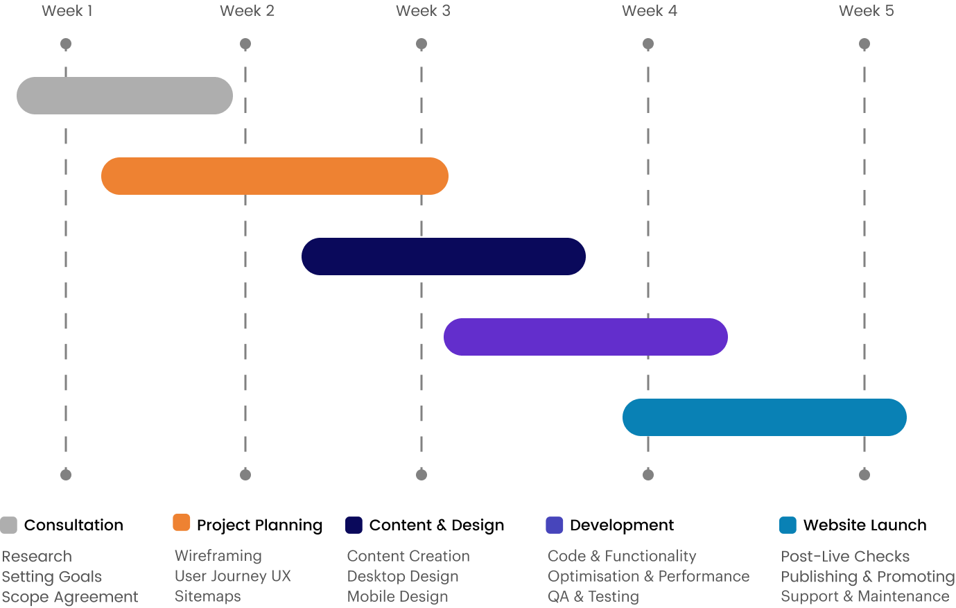
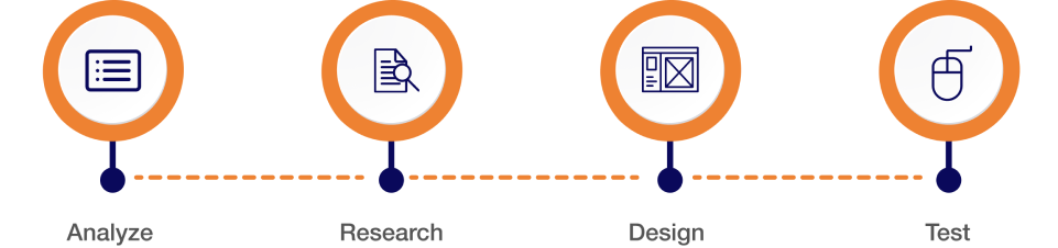
Project Timeline
Usability Testing Insights
Users expressed dissatisfaction with the chat feature, login issues, slow response rates, and technical glitches.
Recommendations included enhancing chat functionality, optimizing login features, and improving payment transparency.
UX Audit
User surveys revealed positive feedback on the updated website design, emphasizing professionalism and ease of navigation. However, concerns about slow loading times and intrusive pop-ups were noted.
Question: How satisfy are you with this new website design?
Jeff Said: We have been very happy with new website! It looks professional and very easy to navigate. You handle things very efficiently and are available for any questions we have.
Question: What kind of device do you use the most to access websites?
Brain Said: I spend too much time browsing the internet. I have an iPhone and a Fire Tablet that I use mainly. It seems we are moving toward a future in which our smartphones will be our only connection to the internet
Question: What kind of difficulties do you face while browsing website?
Martin Said: Some websites loading time is too slow, When i browse something, I am facing an irritating popups with bad color combination and designs. Unnecessary count down timer for downloading and loading of pages.
Question: What are your thoughts on our new website?
Steve Said: I honestly wouldn’t spend more than 5 seconds looking at your old website. It doesn’t seem professional or informative. But now, your new website really looks nice with good relevant content.
Question: What calls to action do you want on our website?
Jenifer Said: Calls to action are requests you give your audience to perform a particular action. You put all of these on a right place.
Usability Heuristics
User Control & Freedom:
User can Cancel a download before it completes.
Consistency & Standards:
We maintain the consistency in our all design.
Flexibility and Efficiency of Use:
We speed up the interaction for the expert user.
Minimalistic:
We are Providing only necessary information in an elegant way.
Visibility of System Status:
Navigation menu items set to underline when a user hovers over them.
Help Users:
We are using toggle options to guide user.
Persona 1: John Smith
Name
John Smith
Occupation
Self-employed
Demographic
34 years old, lives in New York. Married with a 2-year-old child, has a middle-income level. He changed his occupation 3 years ago after getting married.
John’s Story
John was working for a global company and did not have much leisure time as his work was taking too much time. So, to start a family, he decided to quit his job and invest his savings in a bookshop, which has been his dream since his university years. All he wants to do is be able to maintain his bookshop.
User Test
Needs Improved design should be scale according to mobile trend and they should rewrite the information and detail in a proper way and try to fix all bugs.
Pain points Actual Information is missing. App is too old and is not proper scale according to mobile view. I am facing some payment issues and app crashes.
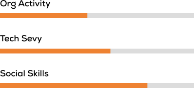
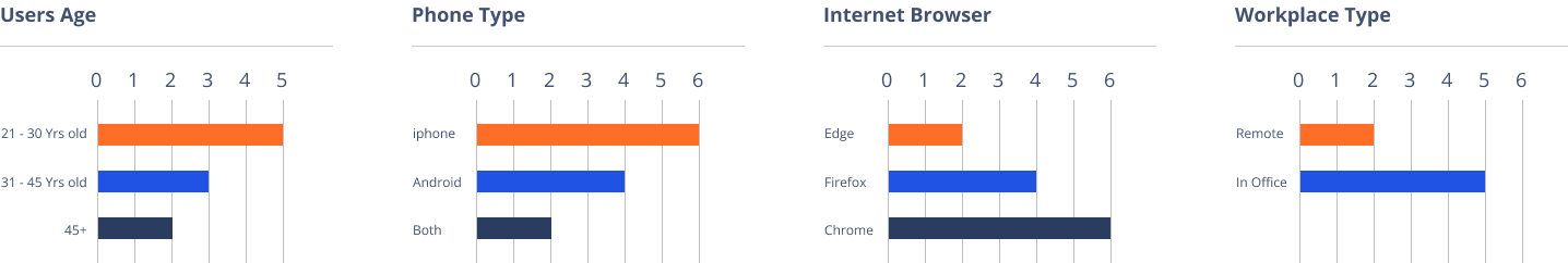
Participant Demographics
Design Process
Zelle Old Illustrations
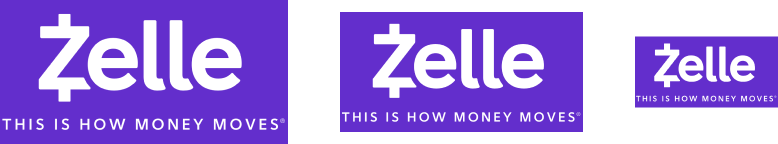
Logo Design
Logo and colors must present the bank as trustworthy and professional. A logo is the heart and soul of your bank, the image that differentiates you from other financial institutions.
Minimum Size
The registered trademark symbol should be on the logo every time used. The relationship between the a and the logo is relative in order to maintain legibility in all sizes. Thee scale separately from the logo when it appears smaller than 60 px tall. At sizes smaller than 60 px tall, the will always be 5 px tall. At sizes larger than 60px, (this ratio is reflected in the standard logo files available to employees and partners).
Used Color Palette
Zelle Colors
Zelle Logo
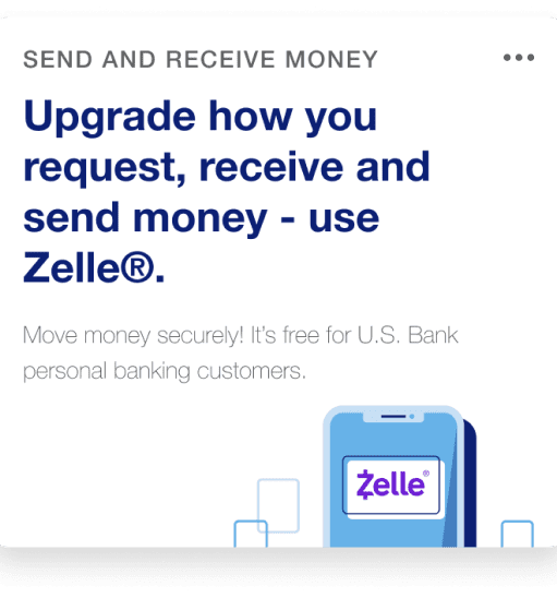
Zelle® is a fast, safe and easy
Way to send money directly between almost any checking or savings accounts in the U.S., typically within minutes’. With just an email address or U.S. mobile phone number, you can send money to people you trust, regardless of where they bank.
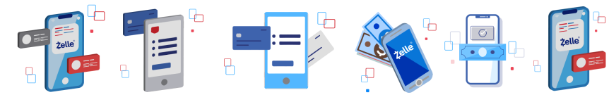
Zelle Final Illustrations
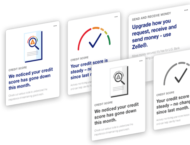
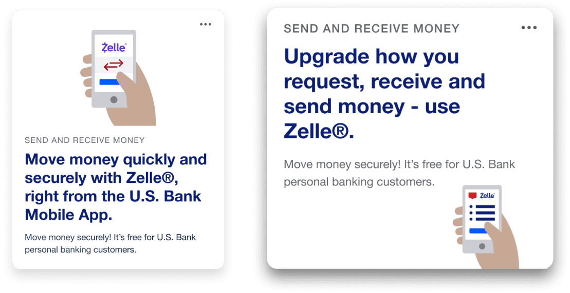
Zelle Insight Cards
Use anywhere, It is accepted to make in-store, online and phone purchases.
Zelle Insight Cards
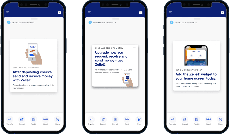
Mobile View
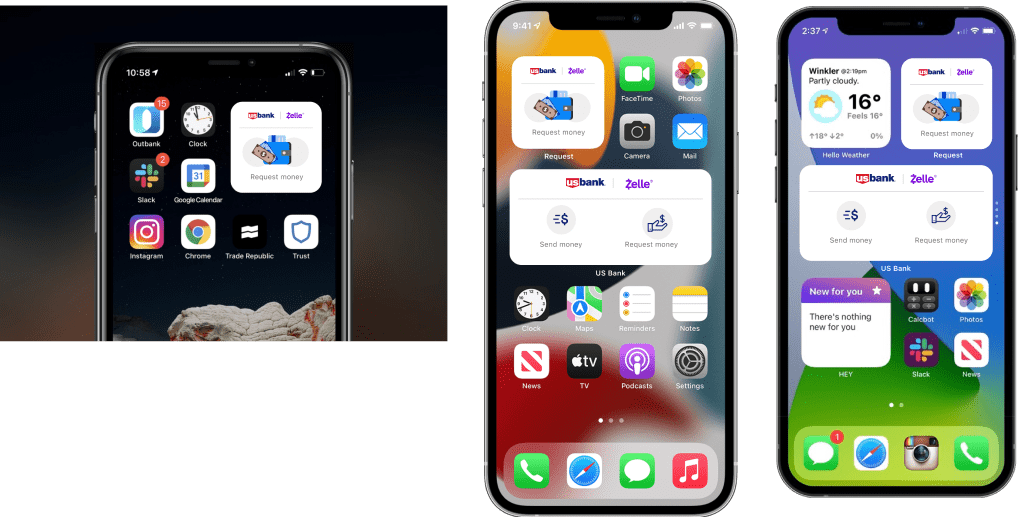
Zelle Widgets
Widgets can be added to your phone’s home as a quick way to access certain information from apps without having to open the app itself.